Matplotlib Tutorial
Humans are very visual creatures: we understand things better when we see things visualized. However, the step to presenting analyses, results or insights can be a bottleneck: you might not even know where to start or you might have already a right format in mind, but then questions like “Is this the right way to visualize the insights that I want to bring to my audience?” will have definitely come across your mind.
What Does A Matplotlib Python Plot Look Like?
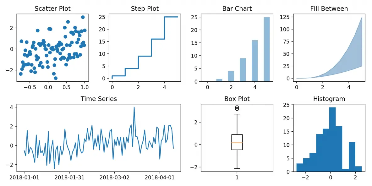
Luckily, this library is very flexible and has a lot of handy, built-in defaults that will help you out tremendously. As such, you don’t need much to get started: you need to make the necessary imports, prepare some data, and you can start plotting with the help of the plot() function! When you’re ready, don’t forget to show your plot using the show() function.
Notes
The Figure is the overall window or page that everything is drawn on. It’s the top-level component of all the ones that you will consider in the following points. You can create multiple independent Figures. A Figure can have several other things in it, such as a suptitle, which is a centered title to the figure. You’ll also find that you can add a legend and color bar, for example, to your Figure.
To the figure you add Axes. The Axes is the area on which the data is plotted with functions such as plot() and scatter() and that can have ticks, labels, etc. associated with it. This explains why Figures can contain multiple Axes.
Note that you’ll sometimes also read about Artist objects, which are virtually all objects that the package has to offers to users like yourself. Everything drawn using Matplotlib is part of the Artist module. The containers that you will use to plot your data, such as Axis, Axes and Figure, and other graphical objects such as text, patches, etc. are types of Artists.
Create Your Plot
Alright, you’re off to create your first plot yourself with Python! As you have read in one of the previous sections, the Figure is the first step and the key to unlocking the power of this package. Next, you see that you initialize the axes of the Figure in the code chunk above with fig.add_axes():
# Import `pyplot` from `matplotlib`
import matplotlib.pyplot as plt

# Initialize the plot
fig = plt.figure(figsize=(20,10))
ax1 = fig.add_subplot(121)
ax2 = fig.add_subplot(122)

# or replace the three lines of code above by the following line:
#fig, (ax1, ax2) = plt.subplots(1,2, figsize=(20,10))

# Plot the data
ax1.bar([1,2,3],[3,4,5])
ax2.barh([0.5,1,2.5],[0,1,2])

# Show the plot
plt.show()